
CASE STUDY
Vegetopia
Helping home growers reach their dreams, one step at a time
This app design guides beginner (and intermediate) gardeners through the process of planning a vegetable garden all the way to harvest. This was my student capstone project at Thinkful: I conceived the project, scoped and carried it to completion. I developed four workflows, tested them at the low-fidelity prototype stage and delivered a fifth at the high-fidelity prototype stage.

Role
UX Research
Information Architecture
UI Design
Usability Testing
Tools
Figma
Google Forms
Zoom
Otter
Maze
Deliverables
Personas
Empathy map
Journey map
User Survey
User stories
User flows
Wireframes
Low-fidelity prototype
Research results
High-fidelity prototype
Timeline
3 weeks
OVERVIEW
The (initial) Problem Statement
Let’s simplify planting information for vegetable growing to make the process easier for home growers (and reduce the oft-cited 1,500 miles our food travels to our dinner plates.)
Audience
Anyone who grows vegetables, whether they do it in pots in an apartment in Boston or in a backyard in Texas.
The (presumed) Solution
To consolidate the growing instructions for vegetables into an app with standardized and easy-to-use content.

Here is part of the master planting chart from John Jeavon’s “How to Grow More Vegetables” where I learned my gardening. I am constantly flipping pages and craning my neck 90 degrees to read the column headers.
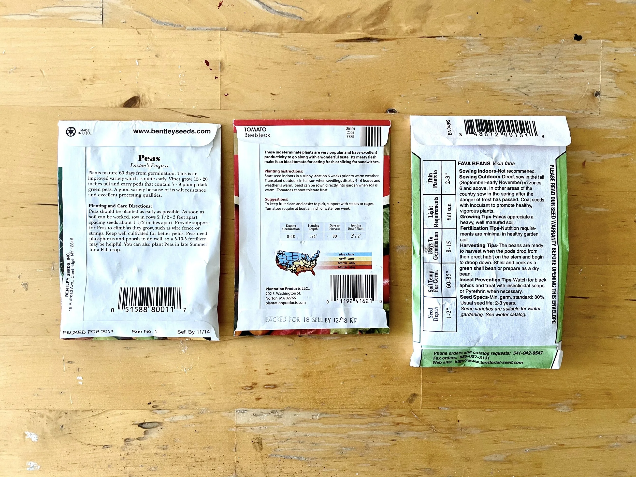
Seed packets are made of paper (that gets wet and dirty in the garden) and provide planting instructions that vary in content, organization and presentation.
My Approach
I’m guided by a user-centered design philosophy to put the users of my product at the heart of all my design decisions. I pursue my solution using the double diamond process: discover the user’s needs, define what the product will solve, develop tested solutions and deliver the final product.
DISCOVERY
User Survey
I realized immediately that finding research subjects to interview that were knowledgeable of the biointensive method was going to be nearly impossible. So, I reached out to gardeners and those who would like to grow vegetables, recruiting from a Facebook vegetable gardening group as well as classmates in my program and personal friends. 48 people responded to my Google Form survey asking about their gardening planning and experiences.

Key Findings
Demographics: the respondents are evenly spread by decade from their 20s to their 60s. Half of them consider themselves intermediate level gardeners and a third were beginners.
Motivations: Most people marked multiple reasons. Three quarters of them cited their motivations were: enjoying time in the garden, the food is better than that of the store and enjoying the challenge; half said to save money.
Information about growing: 37 (or 77% of respondents) use websites or apps, 32 (67%) relied on people they know and 21 (44%) read the back of the seed packets. Mostly they carry this information into the garden in their head (31) but they also bring electronic devices (21) or paperwork (18).
Planning: 24 respondents (50%) do 'some' planning and have some documentation while 12 (25%) do minimal planning; 11 of 14 beginners do minimal planning. Similarly, 24 (50%) said they handwrite their plans on paper followed by 9 (19%) who type it all into a computer.
Note taking for success: Though 26 take notes, 18 of those say it's only sometimes, the notes are disorganized, and they get lost. I sense a problem here.
Support for an app concept: 34 said they'd like to have an app to have that information on their person while 10 were neutral on the matter: that’s 90% positive or neutral. 43 would want it as a mobile app.
REFLECTION: Seeing patterns is difficult given all the 'check all that apply' responses that I offered: I locked Excel columns, sorted data often. The picture that was forming in my head is that there is a mismatch of where the information is – e.g. internet, other people's heads, printouts – and being able to use it where the garden is. Paper seems problematic in that half might be handwriting plans but only a third bring that into the garden. The same might be true about note taking. I'm imagining rain, dirt, and squatting in a garden bed make for a difficult situation for paper, pens, and keeping organized. Advanced gardeners did more planning and had their information in their head compared to beginners who did less planning and varied in how they got information.
Competitive Analysis
Going onto the app store on Apple, I scanned for gardening apps and specifically for vegetable growing. I downloaded and studied the following three: Seed to Spoon, Planter, and Veggie Garden.

My key insights are as follows:
App field is relatively thin… There are many gardening apps out there but comparatively few for vegetable growing.
Veggie apps category is ripe for a new entry… For comparison, a plant identifier app has 304K downloads yet the three veggie apps I chose to study only had 4K, 2k, and 143 downloads.
Veggie app approaches vary… One was very focused on a drag and drop feature to build a garden plot. Another was had a calendar focus with good sorting functions. Another was very robust in information — I’d argue too much so — with many layers of navigation.
A ‘beginner’s approach’ is lacking… None of the approaches quite seem approachable enough for the beginner even though they had most of the basic information needed.
Visually no one has 'won'… While no one did a terrible job (except for text being small or navs being crowded.) But there is plenty of room to explore making my app beautiful and simple.
Research Interviews
From the survey I recruited two beginner gardeners and three intermediate ones to interview. I asked about their veggie growing process to discover:
How they get their information to plant, tend and harvest vegetables.
What tools they use in planning.
What are their pain points.
How an ideal app would work.
“(Erica, a beginner says...) You can go on a website and print out pages. You can follow instructions like the directions on the back of your seeds, but do I know if that’s gonna yield anything? No, I really don’t — most time it just dies. So, I think it’s just being able to know. I’m still “it’s not 100% guaranteed” that this thing is gonna, like, be harvested. But if you’re doing all the steps, I feel pretty confident, like, that this will yield something. If it hasn’t died yet – two weeks, three weeks into this – and it’s still looking good, I think that there’s something to be said for that. Eventually, you’ll move out of the beginner phase and into intermediate.”
Key insights
Information complexity. Beginners have so much trouble with getting reliable information that they fail to start a garden sometimes, have low confidence even though highly motivated. Intermediate gardeners also are constantly searching for solutions on the internet but also via friends, Facebook groups, Youtube. All would welcome a rating for “ease of growing” a specific vegetable. Note: I had to research if that idea was even possible and think through USDA growing zones!
Planning is minimal. Despite the survey suggesting otherwise, no participants mentioned calendars, placement diagrams, timing, harvests etc and did not create documents. This may be related to information complexity. Note: the idea of a garden-plotting app seems out the window for an MVP.
Notes and picture taking Initial interest varied but 4/5 take photos already. 2/3 of the intermediate gardeners see value in note taking especially if it’s easy to do or have big plantings to keep track of.
Step by step The beginners’ lack of confidence leads to comments such as ‘Just tell me what to do’ and ‘Make it as easy as building Legos’.
Electronics Gardeners really rely on Google, Youtube, Facebook. They carry devices into garden or run inside to look things up. Bookmarks, forums etc. all reside in different places though, which complicates things.
Alerts / reminders At least 4/5 would welcome this feature for confidence and for success. One said ‘it would be good for a beginner’ but may not use themselves. Another wants to make sure they would apply to her zone. I propose users would want some level of control over this feature.
REFLECTION I was surprised how little planning and documentation there was among the interviewees compared to my own experience. It was thought provoking to me that advanced gardeners carried their years of experience in their head and drew on planning systems they developed over many seasons of growing.
Personas
The competitive analysis and interviews made me think that the app should cater heavily toward beginners like "Shawna" who is a composite from the interviews and survey I performed.

Shawna Tibbets
"The Beginner Gardener"
55 years old
IT Systems Manager
Rents a house in Austin, TX
Motivation: Believes in eating fresh and healthy, believes food creates community, wants to be a good example to her son regarding accountability for making things grow. But she has a black thumb.
Frustrations:
Googles everything yet often ends up unable to start
Printouts get lost (an attempt at planning?)
Often carries her laptop into her planting area but sometimes is lazy
Doesn’t know when to harvest
Can’t diagnose plant problems
“Just tell me what to do, like Legos instructions, step by step. Put two things together and eventually you have the Millenium Falcon.”
Tom Powell
"The Intermediate Gardener"
36 years old
Mechanical engineer
Owns a house in Baltimore, MD

Motivation: He would happily spend all day in the garden because of the calm it provides: his day job is draining. He loves the challenges of the garden and the payoff of tastier and healthier food. During the long days of summer, he has his dog with him, invites his wife out for a cocktail to delay going inside for dinner.
Frustrations:
He wants to identify his bug problems and tame them faster
He didn’t know about the companion conflict between potatoes and onions
He didn’t expect such a log jam with of all his veggies ready to harvest during same three weeks
He doesn’t want to run in the house for a computer to answer his questions or use paper in the garden which gets wet, or lost and is hard to keep organized
“I had these disgusting bugs for a month and a half. The Facebook group I’m part of helped me solve it. Next year, I might try the straw bale method from Martha Stewart.”
Journey Maps
Tom, the intermediate gardener, generally has quite a positive experience, staying above the neutral baseline except when he gets an infestation. One of his biggest problems is having too much to harvest at the end!

Opportunities
Consolidate key planting information in one place
Potential problem and solutions readily available
Social feed for people to learn and share with each other
Advice on processing harvest
Notice below how dramatically different Shawna’s experience is: she is consumed by information overload yet lacks the knowledge to understand what she she needs to do in most scenarios. So, she spends most of her time below baseline - it’s only her strong sense of motivation that keeps her involved over the many months of the growing season.

Opportunities
Consolidate key planting information in one place
Give detailed growing instructions
Alerts and scenario-based instructions
Image-based instructions to see what to do
DEFINE
User Stories
Based on my research and especially the interviews, I created a list of user stories to help decide what the app might do with an eye of what would constitute a good “minimum viable product” (MVP) and ruled the rest ‘out of scope’.
As a beginner gardener, I want to find the easiest plants to grow, so that I can have a chance at success.
As a beginner gardener, I want to find what I can plant today, so that I don’t have to plan in advance.
As an beginner gardener, I want to have alerts, so that I tend to my plants at the right time.
As an intermediate gardener, I want to create a plant list, so that I can see my plan in one place.
As an intermediate gardener, I want to ID those bugs, so that I can eradicate the problem.
As an intermediate gardener, I want to make notes and take pictures, so that I can track problems
Out of scope:
As an intermediate gardener, I want to use a social feed, so that I can learn and get inspired by other gardeners that are growing the plants I’m interested in.
As an intermediate gardener, I want to see a shared calendar for all the veggies I choose to grow, so I can see an overview of my year's planting.
As an intermediate gardener, I want to use a plotting feature for planning the beds, so I can plan quantities and avoid plant conflicts.
As an intermediate gardener, I want to fertilize my soil correctly for each plant, so that they produce abundantly.
As an intermediate gardener, I want to use a companion plants chart, so that my veggies don't have to compete unnecessarily.
As an intermediate gardener, I want to see varieties of each vegetable, so I can pick the tastiest ones to grow.
User Flows
At this stage I spent time trying to decide what was realistic to deliver in 3 weeks, trying to whittle down the flows to 4-5. The ‘alerts’ flow seemed like a possible sacrifice given the amount of screens it would require to produce. I wondered if there was any way to combine ‘find easy plants’ and ‘find plants I can plant today’.

Site Map
During the sketching stage, I had an insight — that I’ll tell you about shortly — which pushed me to change the structure. The yellow pages were the ones I believed I would have time to develop given the time frame available. Some of the envisioned content initially would have to be put off to a future release.


Sketches
During the sketching process I was working on the following questions:
Do users need need to create an account? (one of my competitors didn’t require it)
How can I ask for their location but protect privacy (use zip code?)
What shall I name of things? (e.g. the app and the nav tabs)
What sort of navigation will I use: notice I have “plant list” in the primary position
Developing the My Garden area to have a “plant log” approach
Exploring the creation of too many features: archiving, joint calendar, companion plant chart!

The numbers above correspond to the questions I was asking myself
Insight
When I showed the plant log page to a person who didn’t garden, their face was one of horror. The thought that they would have to input dates provoked a strong reaction; this sort of tracking had seemed ‘obvious’ to me coming from a biointensive background. This stunned me, forced me to step back and rethink my approach. I came up with a revised problem statement and reworked my sitemap.
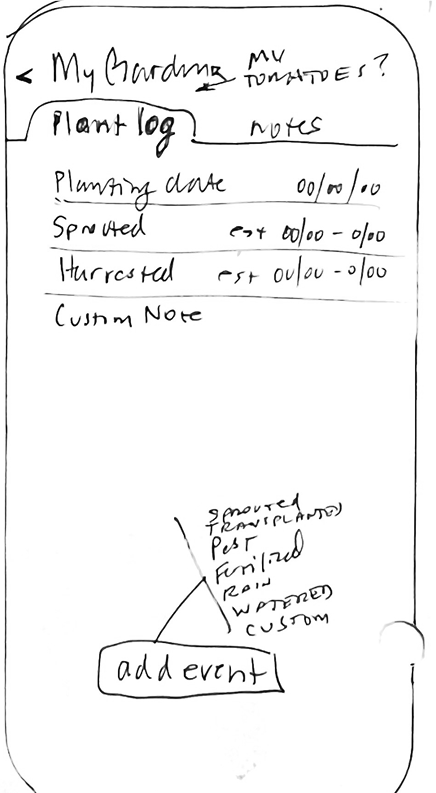
Revised problem statement
How can we give beginners confidence at every step of the way from planting to harvest?
This reframing propelled a new approach to the My Garden section of the app. It would now act as a time-release capsule to deliver bite-sized tasks to the gardener at the appropriate time. Using the information from the plant detail pages, how-to instructions could be developed with a visual emphasis and the step-by-step approach that Shawna craves. When each task gets marked as ‘done,’ the app handles the timing of when the user needs to do the next one.
The next round of sketches focused on the following issues:
Pivot to teaching focus = My Veggie Garden is where users land
Still fiddling with naming of various elements (‘My Veggie Garden’, what to call the items in the navigation bar) to make them different enough from each other to be intuitive to users
Deleting “companion plants, calendar” - in order to scope the MVP appropriately
Thinking for a moment of having no navigation at the bottom
Integrating “Notes” into the “Task” area
Developing icon ideas for secondary navigation
Exploring how to integrate alerts using the onboarding and the “Account” area (though still not sure if I would have time to develop these)

Paper prototype
In order to surface any obvious issues early, I tested the concept using a paper prototype with one person prior to investing the time to build out the wireframes. Three out of four user flows went flawlessly; the last one had a bit of confusion but only because of how I phrased the question to avoid using the exact wording in the paper prototype.

Wireframes
Moving on to Figma to prepare for user testing, I was focusing on the following issues:
Creating multiples of the same screen in order to mimic different scenarios for user testing multiple flows.
Using components flexibly for different functions: list of chosen plants, tasks, plant cards.
Focusing on the beginner, providing visuals and simple steps to follow.
Resolving the hierarchy of navigation: primary (permanent tab bar with icons) and secondary navigation (contextual with highlight bar.)
Focusing on accessibility features that account for sound, sight and possibly wearing gloves which complicates typing!
Crafting a solution to merge the user flows of finding 'what is easy to grow' and 'what can be planted now.'


Usability Testing
I used Maze for the first time and was able to remotely test 30 participants on four user flows.

Choose a plant to grow: 93% success rate. Was it Intuitive? Positive 21 to 3 negative.
Find an 'easy' and 'plant now' veggie: 79% success rate. (Direct 29%, Indirect 50%*) Was it Intuitive? Positive 11 to 5 negative.
Find out whether a bug is a pest: 91% success rate 17/19. Was it Intuitive? Positive 15 to 4 negative
How to create a new note: 100% success rate. Was it Intuitive? Positive 21 to 1 negative.
* While I’m pleased with the success rates for the tasks being so high, my one concern was the ‘find easy plants to plant now’ user flow: far more people succeeded on the task by an indirect route than by a direct one. I addressed that later by:
Planning for the search bar to accept tags on the back end for queries such as ‘easy’ and ‘now’.
Trying two other icons that would be better identified as a filter.
Adding ‘sow now’ to certain plant cards. After doing research on the planting dates of various plants, I discovered that they vary greatly: some are able to be sown over a window of a couple of months while other can be planted at multiple times during the year.
Another thing that pleased me was that the positive feelings about the app outscored the negative by 20 to 2.

Accessibility
I considered this throughout the project in the following ways:
Color Contrast and Blindness: I downloaded and used the Stark and Color Blind plug ins for Figma to test the text elements.
Strike zones I made all the touch points to be a minimum of 44px x 44px, usually adding an invisible box larger than the target icon or text to ensure ease of navigability.
Dictation provides a choice to users for inputting information on the notes page and in the search bar.
Video on the task pages provides visual learners with a concrete example to follow.
Audio: in addition to the audio provided with the videos, I would work with developers to ensure that we have text to speech compliance for screen readers: HTML tags and ARIA labels structured correctly and named well for navigation.
Thumb reach: Given that we have a skew toward right-handedness and many use phones with one hand, I considered moving the ‘add plant’ icon to the left side; I decided against it without having real data to drive that. Also, I decided against moving the search bar to the bottom of screens lest it break too much with established conventions.
DEVELOP
Brand characteristics
Given that I've focused in on the beginner segment of gardeners (while still serving the intermediates), I want them to be supported as much as possible on their gardening journey so that they make it to the next level. Not killing plants is key! Here are my key brand words that will inform my design choices
Optmistic
Simple
Encouraging
Mood board
Here is what I was responding to when I selected images for the brand mood:
Looking for the simplicity of LEGO instructions.
Wanting the calmness of negative space.
Inspired by the rainbow of colors in vegetables.
Exploring typography that is simple vs has personality (friendly or a bit stylish or unique)

Brand name
I started with a word association exercise based on the stated motivations gardeners provided in the survey:
GARDEN, bounty, harvest, trowel, shovel, soil, dig, harvest, plant, seed, how, rake, water, weed, seedlings, cotyledons, pests, fertility, fertilize, dirt, gardener, hat, gloves, widger, hose, flat, transplant, tend, slug, aphid, amend, companion, marigold, sow, seed packet, start, pot, crop, cover crop, mulch, frost, till, leaves, roots, veggies
LEARN, begin, steps, train, advance, study, practice, improve, test, prove, teacher, mentor, teaching assistant, lab, graduate, exam, manual, text, quiz, book, notebook, journeyman, master, professor, tutor, novice, belt, certificate, graduation, valedictorian, honor roll, progress, thesis, paper, curriculum, 101, PhD, challenge, know how, process, lessons,
ENJOY, thrill, bask, delight, love, revel, relish, fancy, frolic, hang, fun, chill, romp, luxury, rejoice,
EAT, chomp, chew, savor, taste, ingest, chow, crunch, gnaw, stuff, serve, cooking up, plow, cook, snarf, hoover
My initial app name ideas were an attempt to create a memorable fusion those themes:
Veggie 1,2,3
Veggies 101
Grown at Home
Home Grown
Garden Grown Veggies
Garden Variety
Ready, Set, Grow!
1,2,3, grow
Veggies at Home
Harvest Hero
Home harvest
Harvest at Home
and the winner is... VEGETOPIA.
It says vegetables, implies an ideal and if the app works well, it’s an implied promise to those that use it.

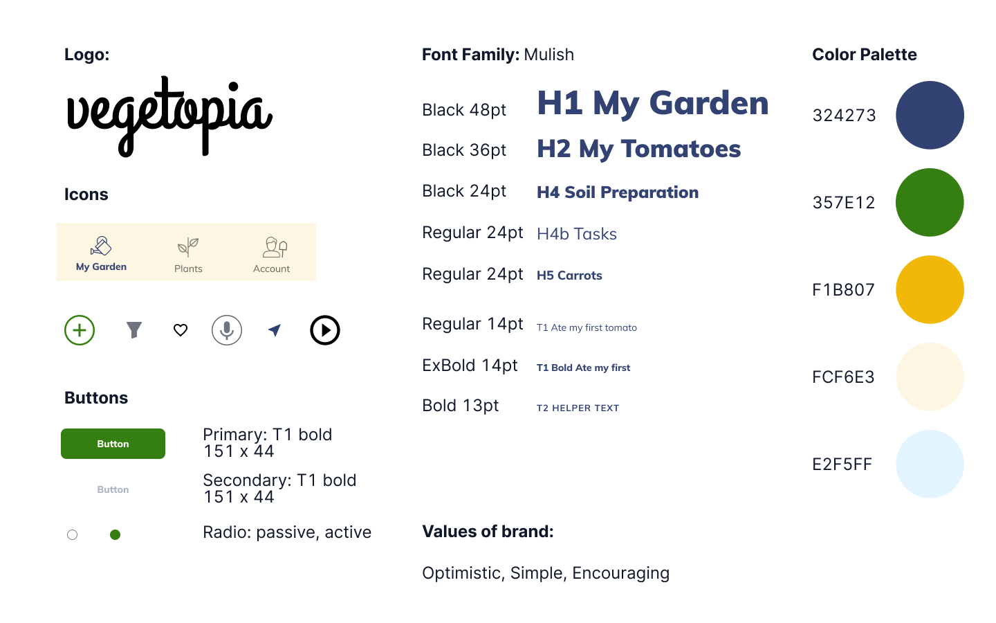
Style guide
Logo
I chose a font called Grand Hotel for the logo. I had to thicken the letter strokes slightly to make it have the right amount of weight. I had considered a bunch of sans serifs but because I was already using a sans for the app itself, nothing grabbed me. Serifs seemed a little formal somehow. A script felt like a nice contrast to the 1, 2, 3, how-to approach I was using to guide beginners. It provided a flow and joy that the app needed.
Colors
I steered away from so many of the great colors I chose at the mood board stage. I had really wanted a brown to reference 'soil' but it had low energy, so I chose a trustworthy navy instead. I had really wanted a red for a call to action but the contrast checker kept making me choose a darker color and I would have ended up with a vague stars and stripes feel. I chose green as my call to action since, 'duh', gardening, and it reduced visual clutter. However, the need to increase the 'optimism' / 'encouraging' quotient led me to brighten the overall palette by adding a mustard yellow for highlight in the secondary nav and its related cream tint for the background of the nav tab.
Typography
For the main typography for the app, I researched and tested six Sans serifs. The one (Inter) that I used for the wireframe prototype was happenstance but I grew to love it and got complimented on it. I liked its heaviest weight for being simple, unapologetic and friendly to my eye, maybe it was a tad industrial but would totally have worked. Libre Franklin was very nice but I felt it was a tad retro. I really liked Lato for its a,g, and t, but the heaviest weight was lacking enough heft. PT sans had promise until I discovered it only had two weights. I almost went with Rubik because it had the weight I wanted and couldn't decide if its brutal quality was quirky, nice or harsh. I landed on Mulish: it had the weights I wanted, the simplicity matching the brand values and that capital M. At first I thought it was deal breaker - just weird - then I thought it's unique and just the right amount of 'character' to stand out.
DELIVER
Hi-fidelity prototype
Aside from tweaking Task Two (filtering for 'easy' and 'plant now'), the biggest difference between this prototype and the last is the addition of onboarding and alerts, neither of which did I originally think I had time to develop. The two are tied together in focusing on the beginners’ needs, but very significantly, they alter the app content in a fundamental way by customizing the planting dates – and therefore timing of tasks! – for each plant and determining whether a plant is viable or 'easy' in a given location. Alerts are intended to be tailored to the level of the gardener and can be customized by the user in the account area.

Conclusion
Sharing my sketches with a beginner and a non-gardener saved me from myself and changed the whole project. The look of horror on the face of one when I showed them a screen that asked them to input a sowing date was priceless, yet it threw out my entire mental model, changed my user flows and site map.
Using Otter for interview transcription was amazing for speeding up the post-interview analysis since reading is so much faster than listening. Searching the transcript helped me to affinity map and find patterns. I was able to copy and paste quotes into an excel matrix to recreate the structure I went into the interviews with, enabling easier comparisons between participants.
Becoming a daily design journaler is helping me mentally process the UX journey in real time.
Survey data: Using 'check all that apply' makes seeing patterns in the results tricky. I want to explore Survey Monkey or “pivot tables” in case they may be the ticket to seeing complex relationships (i.e. cross tabulation) between specific participants' responses in one question compared to what they say in others.
FIgma: Committing early to components, autolayout, text and color styles, greatly sped my process thereby enabling me to exceed my initial user flows.
Maze: A wonderful tool, but one can't see why tasks fail, can't clarify the task for the participant if they're confused. Therefore, results can get skewed. "Successful" tasks are best designed with only a single path but that doesn't mimic real life.
Scoping: With this project I've improved at scoping what is possible in the window of time provided: deciding the number of critical user flows and eliminating those that aren't critical for an MVP.
Testing: I'd love to test gardeners of different expertise levels using the app indoors for planning. Then, see them outdoors in the garden, possibly wearing gloves, squatting in the garden to see what their interaction with the app looks like: which hands they use, how they take notes, etc.