
CASE STUDY
Omnie
The friendly transit app for bus riders
Bus riders don’t want to run, but they will if they think the bus arriving at the stop is theirs. This app design will reduce that running by providing riders with better information. Solving the app’s three business requirements was my first project at Thinkful and served as an introduction to user-centered design and the double diamond process.

Role
UX Research
Information Architecture
UI Design
Usability Testing
Tools
Figma
Google Forms
Zoom
Notion
Deliverables
Personas
Empathy map
Journey map
User Survey
User stories
User flows
Wireframes
Low-fidelity prototype
Research results
High-fidelity prototype
Timeline
4 weeks
OVERVIEW
The Problem Statement
Let’s reduce the confusion at the most-complained-about bus stop, Washington and State, which is now served by seven bus lines.
Audience
All the inhabitants of our Midwestern city — whether they ride the bus or not — are paying taxes to support this transit system. Therefore, we must consider people of all ages and abilities.
The Solution
To provide an app that updates bus schedules with real-time bus arrival information, allows filtering of bus lines, and calculates the walking time to a stop.
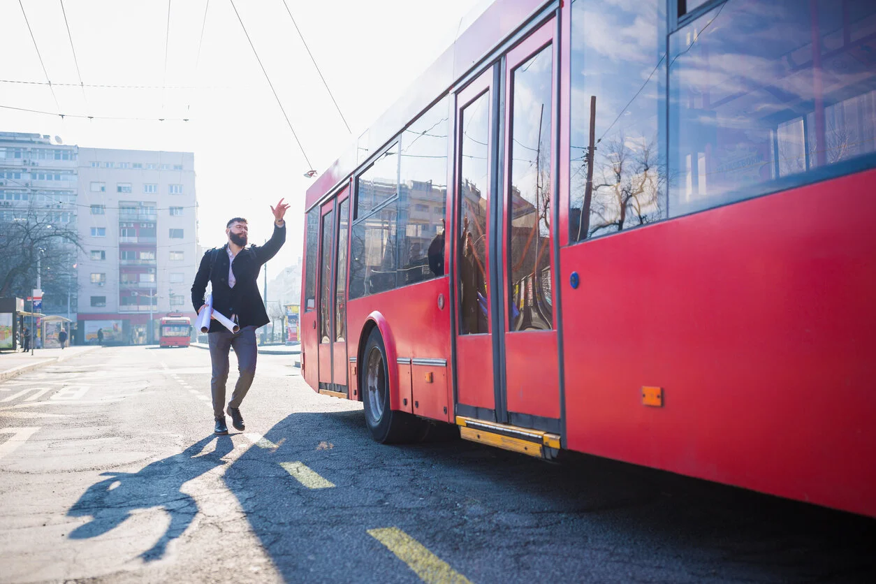
Why is he running? With accurate information beforehand, he wouldn’t need to.
My Approach
I’m guided by a user-centered design philosophy to put the users of my product at the heart of all my design decisions. I pursue my solution using the Double Diamond process: discover the user’s needs, define what the product will solve, develop tested solutions and deliver the final product.
DISCOVERY
The client is a transportation agency for a Midwestern city. They currently list the expected bus schedule on their website and post it at each bus stop, but factors like traffic and helping people with wheelchairs throws off the schedules. This creates anxiety for users trying to get home. Furthermore, riders who used to frequent a bus stop served by one bus line may discover it now serves several. The expansion of bus lines gives better service, but riders find themselves running to catch a bus that is not theirs.

Competitive Analysis
To better understand the look and feel, the features and user flows of what is currently available on the market, I want to my app store and downloaded the following apps: Google Maps, City Mapper, Moovit and PDX Bus. I performed a SWOT analysis and an informal task analysis for each. Google Maps proved to be a key piece in this project, so I’ll spend a moment to show the type of study I was doing at this stage.

Key Findings
Strong competition There are many transit apps out there. They can all accomplish the tasks we seek to answer (but with varying ease.)
Filtering bus lines Google maps had an exceptional example that we could follow for Washington and State. However, we might not know it existed at first glance!
Bus stops are hard to find One site had an option to click on map that I missed (so much info on map) and had a terrible time locating it otherwise. Another had poor color contrast. Searching by number was hard.
Things to emulate 1) Prepopulation as one inputs text varies by app but is very welcome. 2) Prominent maps that can be pinched and blown up. 3) Including a photo of the bus stop.
Typographic hierarchy When done poorly, one doesn’t see the prepopulation of inputted text, nor the bus line of next departing bus, and on busy pages the text block can look like a less-than-useful grey block...
User Survey
I wanted to know what method bus riders use to plan their bus trip and to learn about their experiences while trying to catch the bus. Using Google Forms allowed me to recruit 35 commuters, ask them 14 questions and screen for potential future interviews.

Key Findings
A map app is the most common tool used for planning trips Though 56% of those surveyed have used this method – more than any other single tool – they actually rely more on a mix of other methods such as search engines, transit apps and printed schedules at a rate of 68% .
Google Maps leads all apps Though it leads in the app realm, it only claims 32% of respondents and the rest are fragmented (e.g. I rely on a transit app that’s local to my market.)
Searching by bus stop is the most popular planning method At 48% this method beats out the trip-planner method (35%) and searching for bus-lines (17%). I personally don’t use the bus stop method.
‘How many minutes before next bus arrives’ > ‘When next bus arrives’ Regarding real-time arrival information, 65% leaned toward displaying ‘minutes until arrival’ over “time of arrival or being neutral about the two.
4 minutes 65% of respondents were within 1-4 minutes from their most often used bus stop.
Multiple bus options 69% of bus riders use a stop where they can take more than one bus line toward their destination. This group will be able to give insights on our Washington and State problem.
Interviews
The next step in understanding our future app users was to recruit five people for 30-45 minute zoom calls. I used the survey results and my own personal network to select for age/gender/culture/ability and including three Google Maps users. I connected with a 25-year old, male bartender on one end and an 85-year old retired widow recovering from hip surgery on the other (with three others of varied ages and backgrounds in between.) The results of these interviews can be found here.
Personas
Our interviews were critical to capture the diversity of bus ridership our app needs to serve. I decided that creating three personas was necessary to capture that diversity and build the empathy necessary to guide my process at key decision points.


Empathy Map
I like hearing that some offices have monitors displaying personas and empathy maps in the UX department so that the team keeps users in mind at all times.

Journey Map
This journey map puts us in riders’ shoes during a bus ride experience and helps zero in on where and when our app can help improve the journey with better data.

DEFINE
User Stories
Considering the interview results and our personas, I explored what we may want to inform out app’s functionality. Here are the user stories that would provide a ‘minimum viable product’ that solves for the client’s requirements and are keyed to one of our personas:
… I want to know when my next bus arrives (Beth)
… I want to know how many minutes I have to walk to the stop (Mimi)
… I want to filter between many bus lines at the my busiest stop (Vladek)
The user stories I considered but held off on were as follows (rating of importance in parentheses):
As a new bus rider, I want to sign up for an account (low)
As a frequent bus rider I want to save my frequent destinations (medium)
As a frequent bus rider I want to buy my tickets on the app (low)
As an elder I want to take the bus when it is not raining or windy or full of passengers (low)
As a regular commuter at Washington and State I want to avoid running to the bus stop (high)
User Flows
The top flow solves business requirement #3 and the lower one handles #1 and #2.

Site Map
Mimicking the user flow, I forked the screens on the site map to solve the three business requirements.

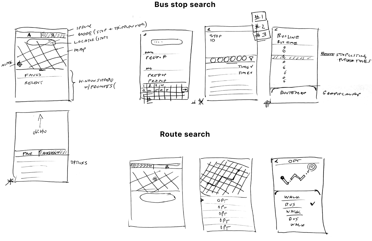
Sketches
Given that my survey respondents are within four minutes from their bus stops and 48% use the bus stop method for planning, I started with that flow imagining that by the third screen I could solve all three business requirements. To help the users, I wanted to incorporate short cuts like prepopulation options as they input their search, offering the ability to favorite a bus stop or choose a recent stop. Then I moved to serve the 35% who use the route method (like me) – imagining inputting a destination, getting a number of bus options in order to arrival time (but with trip duration shown) and finally a detail page that would solve two requirements.
Wireframes
Here are the initial wireframes I created. The navigation is at the top and I’ve defined all the trip options with outlined boxes.

Here, I moved the navigation to the bottom and reduced the visual noise by replacing the outlines around results with a tint box. There would be 5 more rounds of revisions to enlarge type size, create a persistent navigation and more.

Usability Testing

I tested my prototype via Zoom with five participants ranging in age mirroring the older part of our target audience: 37, 39, 47, 56, 85. Out of ignorance of best practices, I made changes to the prototype between each participant to solve 1-2 very apparent problems that needed addressing. Happily, the tasks were accomplished each time with relative ease. Our 85-year old had the most difficulty, but that was expected to be the strongest test; the prior and following participants had much less difficulty.
The four tasks were on the difficult side in my opinion since I wanted to really test the app and participants:
Task 1: When does the #10 arrive at Washington and State?
Task 2: When is the first #5 bus after 1pm at Washington and State?Task 3: When does the first #7 bus arrive at Washington and State?
Task 4: How many minutes walking is the bus stop for the first available bus home?

Revisions from testing
Remove lines
Search results should have color background rather than rules around them to make the legibility of content more prominent
Add contrast to the map
The clickable areas should be in color (i.e. bus stops) and the map itself should be a muted warm gray.
Change “actual” to “arrives”
This will clarify that ‘arrives’ refers to the bus rather than something more ambiguous. It also pairs better with ‘Sched”.
Flesh out labels
Prior to testing lo res prototypes, be careful to write out enough information to limit ambiguity so that tests are more revealing
Add photograph of bus stop
Using a photo (instead of map with all lines of buses) will add visual interest and add a layer of information to help app users in reaching their destination.
Enlarge button strike zones
A user said she had ‘sausage fingers’ and was seen trying to his buttons multiple time with no success.
Make bottom nav consistent
Since the standard expectation is for it to be a bar, make it a bar to reduce ambiguity.
Put arrival time in own column
Current position is to embedded within other information and we need to improve its ‘findability’ to meet the business requirements.
Modify filtering function colors
For visual hierarchy need to add green to selected lines and leave the rest grey (one shade rather than the two initially used.)
Accessibility
Having Mimi as a persona helped me focus throughout on the need for accessibility, especially for eyesight and coordination. Using the WCAG contrast checker guided me to make color changes until I reached the assessment below. I kept my important text larger than 18pts and the smaller text was helper text. Initially, my strike zones were too small until I figured out how to group my icons/links with an invisible, larger box.

DEVELOP
Mood Board
My inspiration was the concept of ‘Sunday driving’, ideally as a passenger so you could sight see. As a bus rider, the ideal is to be able to get a window seat, relax and watch the world go by as someone else takes care of getting you where you need to go. The two driving images helped pluck some colors to consider. That Sunday drive made me look for interfaces that made me feel relaxed and look for motifs that implied turning wheels or motion.

Brand Development
I wanted my personas using the bus to be curious, excited, exploring, alive and peaceful.
I wanted my app experience to be sunny, easy, clear, courteous, friendly and graceful.
A word association game helped me come up with potential concepts to remix.
BUS: hop on the, school, seats, read, window relax…
STREET: asphalt, grid, wheels, lights, signals, traffic, route, stripes, green, yellow, red, stop sign…
SUNDAY DRIVE: sunshine, wind, warm, slow, convertible, trees, road trip, relax, clouds, sky…
COMMUTE: work, morning, ticket, fare, drive, tram, lane…
I tried to remixing those concepts to come up with potential brand names, still in a brainstorming mode:
curious stripes
cloud wheels
cruise cloud –> cruze
window coast
magic carpet ride
window seat –> dosie
relax route –> roulax
cloud ride
gobus
trip friend
wheels alive
skybus
buster
hopper
With nothing sticking, I put it on the back burner to percolate, waiting for random inspiration to strike whether it is while cooking or showering. The breakthrough was looking into the history of the bus; isn’t that a curious word? It’s from Latin it turns out:

This discovery of ‘omnibus’ was one of the happiest moments of the entire project - it is rare indeed to strike gold like this! This direction would honor history and is so appropriate given that the concept of ‘for all’ drove our discovery phase creation of personas Beth, Vladek and Mimi. Trying to turn it into a memorable brand name pushed me to explore the concept of adding ‘ease’ into the mix and start exploring visual treatments.

“Hop on the bus” lingered a long time. “Ease” was impossible to untangle from ‘iss’ and ‘iz’ for certainty in pronunciation.

I explored many typefaces looking for the brand attributes and finally chose to work with Fugaz One.

To transform the font into a logo, I created a backward lean, ligatures and a smiling ‘e’. Now, it easy to pronounce and friendly.
Style Guide

DELIVER
High-fidelity Prototype

Learnings
● To use the survey as a funnel that screens the right potential participants into interviews in order to make the best use of that time spent: e.g. users of Google Maps and ages reflecting our target audience.
● Components — or lack thereof — made a mess of my files.
● Brand work doesn’t end: decide what is enough.
● Animation from scratch is in ‘yet’ category
● A usability test matrix and a notetaker would have kept me much more organized!